Making Environmental Data More Accessible through a Digital Tool for NYC Flood Preparedness
Written by Shuo Feng

How can NYC residents access and understand critical flood information scattered across multiple technical data sources to make informed decisions during emergencies?
New York City collects extensive environmental data through various monitoring systems, including FloodNet sensors, National Weather Service alerts, and community-reported flood conditions. Although this information is publicly available, it's scattered across multiple technical platforms and presented in formats often designed for experts, not residents. During flood events, when timely information can be life-saving, residents may struggle to find and interpret the data they need to make informed decisions about travel, safety, and emergency preparedness.
This summer, as a Siegel PiTech PhD Impact Fellow working with the Mayor's Office of Environmental Justice, my project focused on three critical aspects of this accessibility challenge:
Understanding user needs through collaboration with environmental justice experts and community stakeholders
Consolidating data sources from technical platforms into a unified digital tool with a user-friendly interface
Designing intuitive interactions that make complex environmental data actionable for residents
Building from Expert Knowledge
First, I worked closely with environmental justice experts at the Mayor's Office, New York Sea Grant, and the FloodNet project to understand how flood data is used by different communities across NYC. These experts had conducted extensive research on environmental inequities and understood which neighborhoods face the greatest flood risks. Their insights were crucial in shaping my approach to data presentation and ensuring my tool serves communities that need it most.
I also engaged with data providers like FloodNet to understand the availability and reliability of real-time sensor data. These conversations revealed both opportunities and constraints: while sensor networks provide valuable real-time measurements, the data requires significant processing to become meaningful for non-technical users. Understanding these technical limitations, I designed my tool to work within existing data infrastructure.
A Method for Data Integration and Visualization
The core technical challenge was transforming disparate data sources into a coherent, accessible, digital interface. While some environmental data platforms like FloodNet have prioritized resident accessibility, many still present information in ways that can be difficult for lay users to quickly interpret and act on during emergencies. We reorganized the data to create meaningful connections—linking information by geography (your neighborhood), time (now vs. forecast), and impact (what it means for you)—rather than displaying raw technical measurements.
I developed a tool that:
Consolidates real-time data from FloodNet sensors, National Weather Service alerts, and MyCoast community photos
Standardizes severity classifications by translating National Weather Service flood categories into everyday language that residents understand—for example, NWS minor flooding becomes "vehicle safety concerns" (water affects cars but pedestrians can cross), while moderate flooding becomes "pedestrian access restricted" (water is dangerous for people on foot).
Provides geographic context by focusing on Brooklyn and Queens, where sensor and photographic data coverage is most comprehensive
My approach prioritized accessibility over technical sophistication. Rather than displaying raw sensor measurements, I created visual representations that translate water levels into actionable information for residents. For example, tire-depth charts show whether water is safe for vehicles. We also integrated community-submitted photos from MyCoast to show real-time street-level conditions that residents can relate to—a flooded intersection looks very different depending on whether pedestrians can safely cross or if subway entrances are affected.
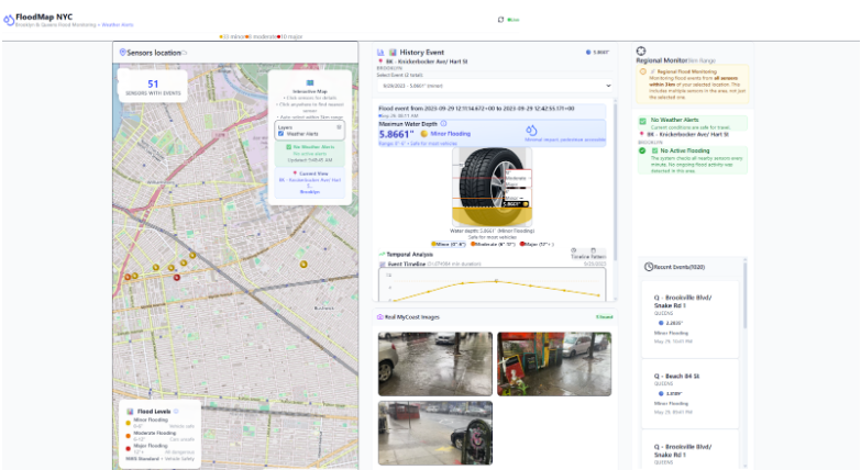
Figure 1: Prototype of my flood monitoring dashboard that integrates multiple data sources into a resident-accessible interface
Validation and Expert Feedback
After developing the initial tool, I conducted validation sessions with environmental justice experts and climate adaptation professionals at the Mayor's Office. These sessions were crucial for understanding the tool's practical utility and identifying areas for improvement.
The feedback revealed several key insights:
Subway flooding integration was identified as a critical missing component, as transit disruptions affect millions of daily commuters
Community-level information needed to be more prominent than individual sensor data
Mobile accessibility was essential, as residents primarily access emergency information via smartphones
These validation sessions fundamentally shaped my understanding of how environmental data tools should prioritize community needs over technical completeness.

Shuo Feng
Ph.D. Student, Information Science, Cornell University
Impact and Path Forward
At the culmination of the summer, I had developed a functional flood monitoring dashboard that successfully integrated multiple data sources into a resident-accessible interface. My final presentation to the Mayor's Office of Climate & Environmental Justice generated significant interest in expanding the platform's scope, including plans to integrate subway flooding data and expand coverage to all five boroughs.
The project was an effort at data democratization, where technical environmental information was made accessible through community-centered design, while maintaining scientific accuracy.
Acknowledgments
This work was conducted under the mentorship of the Mayor's Office of Climate & Environmental Justice team, with valuable collaboration from FloodNet, New York Sea Grant, and community stakeholders. I am grateful for their guidance in understanding both the technical challenges and community needs that shaped this project's development.